Friday, 22 March 2013
Thursday, 21 March 2013
Tuesday, 19 March 2013
Tuesday, 12 March 2013
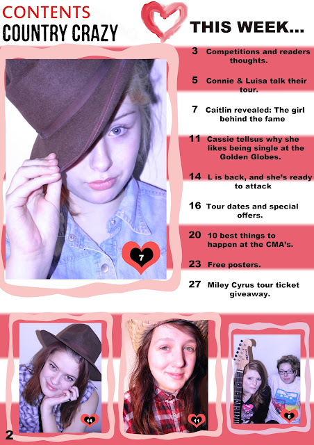
Contents draft 2
I will change how the "page" collumn is set out as it is not conventional of a magazine. I will make it more spread out. I also want to put captions on my pictures, which is also conventional of a contents.
Front cover draft 3
I wanted the background on this to be more natural, as for my last front cover draft it was yellow. The background also matches the background of my double page spread which gives a sense of continuity in the magazine.
Tuesday, 29 January 2013
Tuesday, 22 January 2013
Contents page draft
I will change the pictures of the contents of images I have took, but this is a rough idea of how it will look.
Feedback on front cover draft
Amy, my first thought upon seeing your cover is that it is not clear that it caters for country music fans. Perhaps they could be something typical of the genre in the shot – perhaps a guitar or something else emblematic of that type of music. Your masthead, however works really well. I'm afraid I cannot say the same for your strapline, which looks out of place. This is true also of that font (is it Lucinda?) That you use on your coverlines and your pull quote. Also there is some blank space waiting to be filled – perhaps an inset picture – on the right hand side of your page (and even the left hand side of your page, where the coverlines usually are). Also 'she offered us tea and biscuits' should probably be 'she offers us tea and biscuits'
Monday, 14 January 2013
Subscribe to:
Comments (Atom)


